|
Describe what you were asked to do for this portion of the logo design process (the creation of 3 variations of 3 logos). We were asked to choose our top three drafts and make 3 variations of each design. Then at the end, we had to choose a logo that was our favorite or represented our brand. What was the most frustrating or challenging thing about the process? I found it challenging to vectorize the hands on my final logo. In the beginning, I hadn't drawn in hands, but towards the end, I realized that he didn't have any, so I struggled to vectorize the hands without a guide. What was your favorite thing about this process? I liked choosing the colors for each design variation. Because it allowed me to express my ideas for each logo. I used Adobe Color to choose my palette and also took images off the internet that represent what I wanted my logo to feel. And using the eye drop feature, I chose colors from the image to add to my palette. What is something you learned from the whole experience? I learned how to more effectively choose colors to fit my design. I also learned how to fill my designs with paint by creating a shape with path and putting it under my outlines. 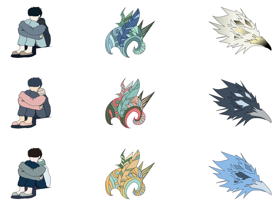 Gives the name of your brand or explain how you decided to create a logo for yourself. I decided to create a logo for myself because I wanted to be able to express myself with a single design. Although I haven't put the name on my design, I decided to name is Wallflower. Because of how I am around new people. Describes your brand. Tell the purpose of your brand and tell us a bit about its identity. It represents me. The design is to show who I truly am. The design is of a boy hugging his knees while sitting on a stair. It implies of a reserved identity and someone who keeps to themselves. Tells us how the logo represents the brand/yourself. The final design which is the boy hugging his knees is how I feel a lot of the time. I normally like to be alone and be alone with my thoughts. So him hugging his knees is a representation of how I like to keep to myself. The clothing is also important. The hoodie and long pants show that I don't like to be the center and I just want to be in my own space. The slippers also show that I am a homebody. Explains why the logo below is your favorite and why you chose it. It is my favorite because I based the color scheme off of a rainy picture. And also because I felt it represented me the best. Because I don't like overly bright colors, I felt that these semi dark/muted colors would fit best. I also like the hair color, because I once had hair a similar blue. The main base color was blue, because blue has a calming effect and also it gives a sad vibe to my design. While most of it was quite vibrant, I felt like the colors and the overall design of my logo matched the mood that I wanted to give off about how I truly am. 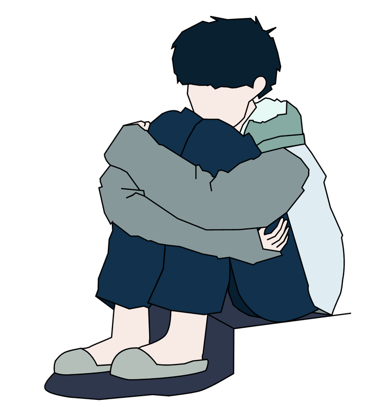
1 Comment
We had to create a logo for ourselves or for a type of shop, business, etc. And I chose to do one for a cafe. The three circled designs are the first drafts that I chose for my design. My favorite one is the starred one. I like it because my concept for the cafe was toward a more East Asian design and I got a lot of inspiration from old Japanese art. At first the design process was a bit hard because I didn't know whether or not I wanted to do a logo for myself or for a shop. I made logos for myself but I realized that they didn't really represent me so I changed it to a cafe logo. The designs aren't final so the outcome will probably look different. 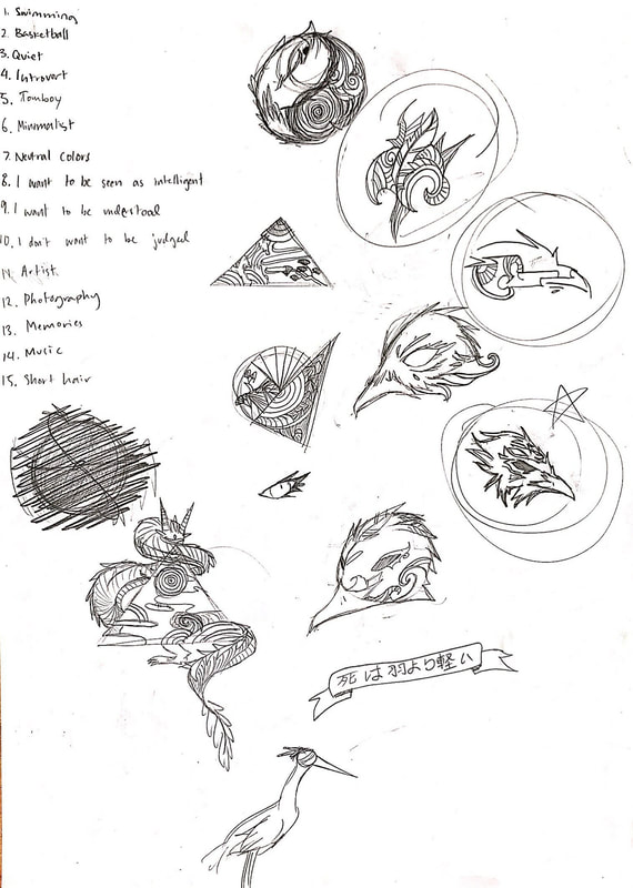 For class, I was asked to create a simple design and make four different color schemes for that shape using Adobe Color. The four color schemes we used were: Monochromatic - one hue - various saturation and brightness levels Analogous - hues that are next to each other on the color wheel Complementary - combines hues from the opposite side of the color wheel Triad - combines 3 hues evenly spaced out around the color wheel I don't have a favorite color scheme because each one has an individual feature that makes it unique. However, for this project, I felt like monochromatic and complementary fit the ghost theme well. I got the inspiration from Sad Ghost Club and from Redbubble. The Sad Ghost Club gave me the idea and I traced the outline of the ghost from Redbubble. But I changed it a little in the end. 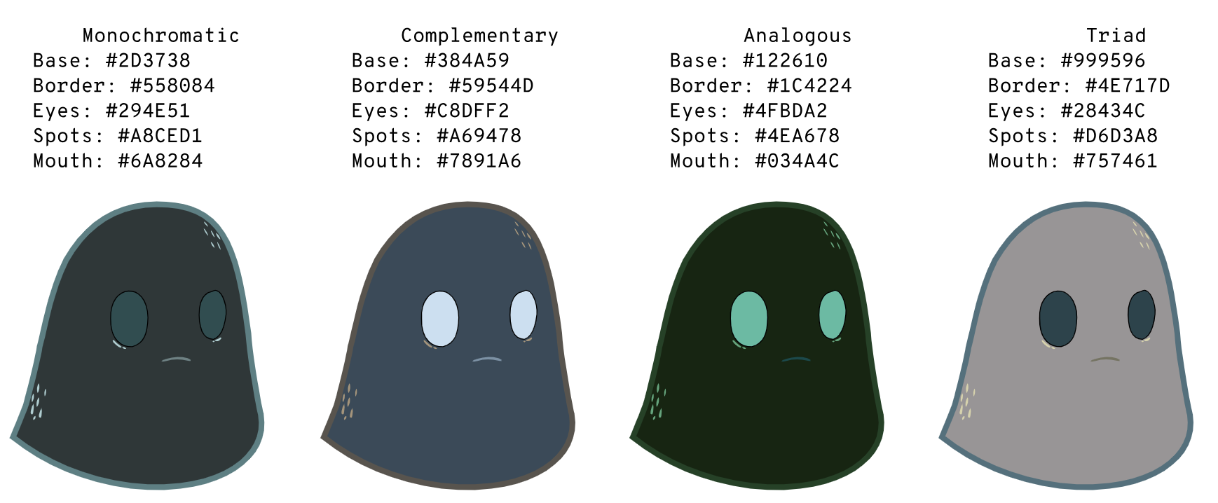 What did I create?I created a Japanese mask on Gravit. We were asked to make a simple design that displayed 15 different colors. Then we would put the Hex code and RGB labels next to it. I made my design by pulling in a jpeg of the design that I found. And traced over it using the path function. What were some challenges you faced? I struggled with making sure that I aligned it properly. And there were two parts in the design so later combining it in the right areas were hard. How did you overcome the challenges? I zoomed in on the lines so that I could trace the shape better. I also used the arrow keys to align it well. To combine them, I used the command G function. What were some successes you achieved? I was able to entirely trace the design and also add in the details. What are you proud of in your artwork? I'm proud of the custom designs that I put in. I didn't want to entirely copy the jpeg image so instead of the designs that were already on there, I made my own. What tools did you use in Gravit? I used these tools: Path, Subselect, rectangle, ellipse, and the text tool. Was there a concept or an inspiration behind your artwork? Yes, I got the concept of the mask after looking at a pin on Pinterest. I was looking for designs or ideas for this project and I found a picture of a Japanese mask. I'm pretty sure the mask was inspired by the Japanese anime "Naruto". Link to art: Mask 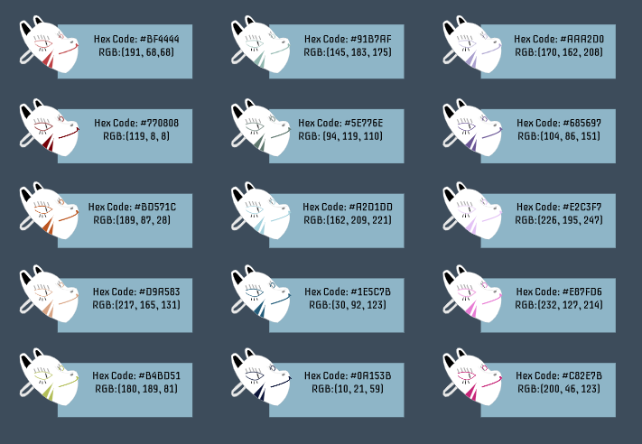 I used lines, rectangles, arcs, stroke, and fill to create my artwork. using the arc command, I created half circles to create the semi-circles. I also used rect to create the gradient shapes in the background. Using the line command, I created splits in the semicircles. I learned how to manipulate the code to move the way I wanted it to. Because I also had former coding experience, I found it simple to do. But I also discovered many new things about JavaScript through this project. What I made represents my personalities and how I act around others. The light side represents how I act around others and people. But the dark semi-circle shows that I have something that I want to hide. The line through it representing a path leading to the dark side. The dark side is my "true" personality when I'm alone. It displays how I truly am without others. I prefer to be silent and alone. But when I'm with others, I have to put up a face in order to please others. The two semi-circles aren't aligned perfectly because it is to show my disconnected attitudes. But the lines are aligned with the ends of the arcs because my personality isn't completely divided. My personality can sometimes be in between how I am around others and by myself. 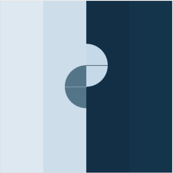 noStroke();
fill(220, 232, 242); rect(0,0,100,400,0); fill(202, 221, 235); rect(100,0,100,400,0); fill(8, 47, 71); rect(200,0,100,400,0); fill(9, 52, 77); rect(300,0,100,400,0); fill(77, 117, 138); arc(200,200,100,100,91,270); fill(193, 217, 235); arc(200,150,100,100,-89,90); stroke(152, 188, 214); line(200,200,150,200); stroke(7, 28, 51); line(200,150,249,150); As the final Gravit.io project, we used all that we learned, to create a scene that is important to us. What I created is a vector design of the single(ep) cover of a musical artist named, Shallou. This particular single, named You and Me was the first song I ever heard from this artist. This song introduced me to a wonderful musician. This is important to me because before a swim competition or something big, I listen to this song. It helps me calm down and it reminds me that in the end it's all right. Also, the cover art was really good for the single. It has almost all the things I like to see, hear, touch, smell, and feel. Night time is my favorite time of day and the stars are something I rarely get to see in the city. Fog, as you can tell is also one of my favorite things to see. Forests and mountains are another view I enjoy. I wish I could show another cover art because many of them include seas, oceans, and bodies of water, I love being near and in water. (more below). 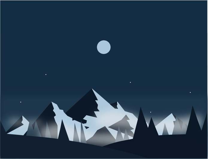 I used the blur option to create the fog like appearance and made it a little transparent. I also used it to blend the background colors together.
A huge struggle was when all my work got erased and I had to restart. But I think my second attempt turned out better than the first time overall. In this lesson, I learned how to merge, intersect, subtract, and use difference to change the way shapes look. I also learned about points and corners to make simple shapes look different.  On Gravit.io, I used shapes and colours to make these designs. I also used the opacity feature to play around with the colours. This was a really fun section to do on vector design. 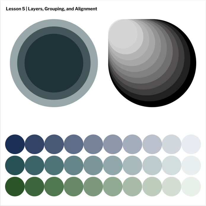 I learned more about Gravit.io and how to use it. We learned how to fill shapes and utilize it. We also learned how to make a border and how we could change it. In addition, we were taught how to change the borders of shapes. Transparent fills was something I found fun and interesting. 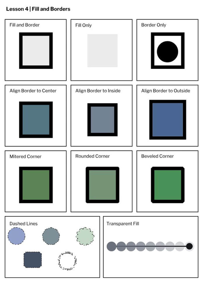 On Gravit.io, I learned how to make lines and shapes. I also learned how to change their shape and make them into paths. I also learned how to enlarge, identify anchor points and more. 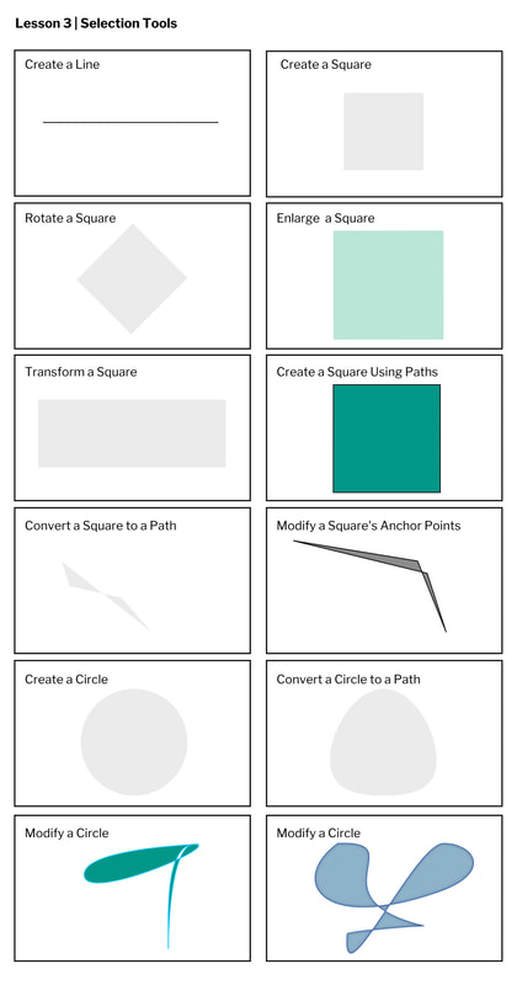 |
AuthorA tomboy dreaming. Archives
February 2019
Categories
All
 This work is licensed under a Creative Commons Attribution-NonCommercial-NoDerivatives 4.0 International License. |
