What I Learned About TypographyTypography is the visual component of the written word. Typography is important because it can change the entire look and feel of a presentation or poster. Because if we didn't have typography, everything would be dull and the message wouldn't get across as easily. “Each font has a personality and a purpose” This means that each individual font does something to the text and reinforces it. Giving it meaning and a feeling that matches what you have typed. There are five basic types of typefaces - Serif - It has 'feet' - Used in large blocks of text - Used in print Sans Serif - Do not have 'feet' - Great for headlines, titles, and smaller chunks of text - Used on the web Monospaced - Each letter takes up the same amount of space - Does not work well for large blocks of text - Used in coding Script/Handwritten - Cursive, calligraphic, or handwritten - Sometimes difficult to read - Good for logos, large headlines, and details. Novelty - Good attention getters - Use sparingly - Popularity comes and goes Typeface ComparisonsWe had to make a Gravit document that displayed all five of the basic types of typefaces. We had to have an example font, give the font's name, and label the type of font it was. 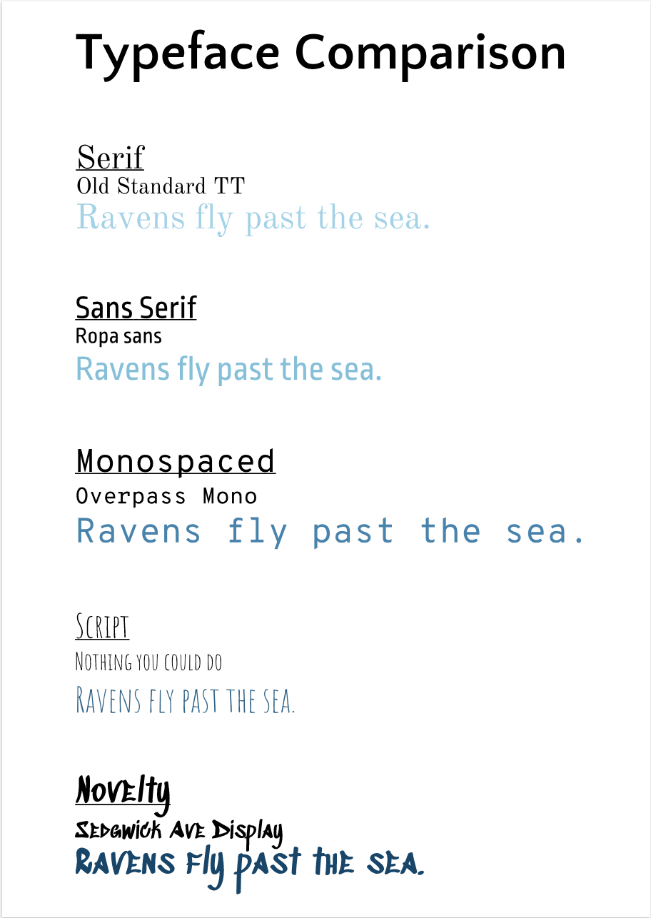 Word PortraitsWe had to make a Gravit document and use 10 different fonts. We had to find 10 words that fit the 'voice' portrayed by the font. And 10 words that went directly against what the font meant. 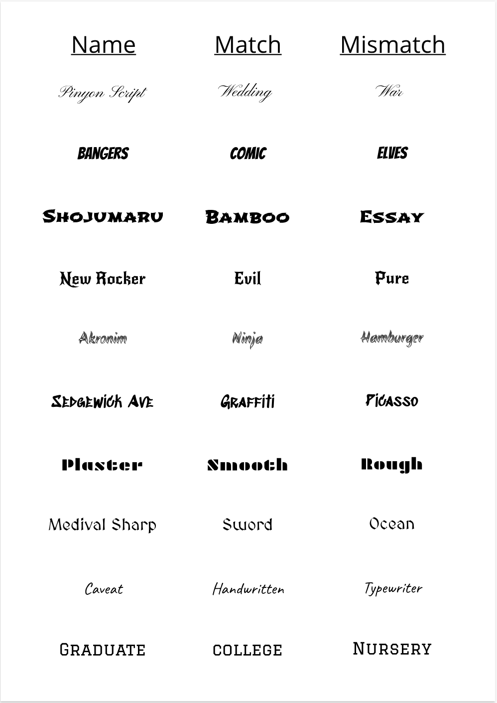
0 Comments
|
AuthorA tomboy dreaming. Archives
February 2019
Categories
All
 This work is licensed under a Creative Commons Attribution-NonCommercial-NoDerivatives 4.0 International License. |
